In this guide
- Build a reading card
- Separate activity from result
- Match the period before comparing
- Read the denominator aloud
- Look for definition changes
- Ask what is missing from the average
- Keep explanation distinct from blame
- Write the narrow conclusion first
- A real source discrepancy to investigate
- Read next
- Sources and limits
A line moving upward is not a conclusion. It might describe more demand, more completed work, a changed definition or a longer reporting window. Before deciding whether a municipal service is improving, read what the measure counts and what it leaves outside the frame.
Phoenix publishes a City Manager’s Performance Dashboard and describes its broader data-and-evidence work through the Office of Innovation. This article uses that public reporting context to teach a reading method. It does not reproduce live dashboard values, rank departments or audit the City’s data collection.
Build a reading card
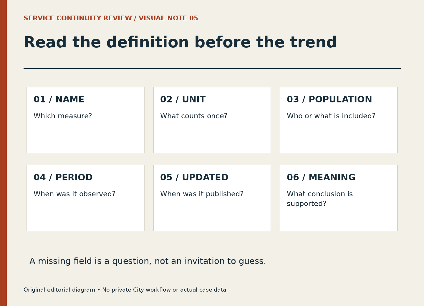
Give the measure six fields: name, unit, included population, time period, update date and stated interpretation. If the public display does not answer one of those questions, mark the field unknown. Do not fill it from a similarly named measure elsewhere.
The card is small enough to keep beside a chart. Its purpose is to slow the jump from a number to a judgment. A count of activities and a percentage of activities meeting a target may concern the same service while answering very different questions.
Separate activity from result
Activity measures describe work performed or received. Result measures describe a condition the service is intended to affect. Neither is automatically superior; each has a purpose. A count can be useful for workload planning, while a result can be influenced by factors beyond one team’s actions.
In a fictional example, a city program records 120 contacts in one period and 150 in the next. The increase is real within the invented data, but its meaning is open. More people may have needed help, outreach may have expanded, or the recording process may have changed. The count alone does not show that residents’ problems were resolved.
Match the period before comparing
A month, a quarter and a fiscal-year-to-date total should not be placed on the same footing merely because they share a label. Check whether the figures describe equal durations and similar seasonal conditions. A cumulative total often rises by construction; that rise is not a performance improvement.
The update date is another clock. A chart refreshed today may contain data through an earlier period. Keep observation period and publication date separate. If the latest interval is incomplete, describe that limit rather than comparing it with a completed interval as though both were final.
Read the denominator aloud
For a percentage, say what appears below the line. “Of the requests included in this measure” is different from “of all residents” or “of all work.” A denominator can exclude unfinished cases, particular service types or records without required information. Those exclusions may be appropriate, but they affect the conclusion.
An invented completion percentage of 90 percent could mean nine of ten qualifying records, or nine hundred of a thousand. The percentage hides the scale unless the count is also known. It also cannot explain why the remaining records differ. Do not turn it into a judgment about individual employees.
Look for definition changes
A service can revise categories, software or reporting practices. A visible break in a trend may therefore reflect measurement as well as operations. Look for notes before explaining the break. When no note is available, “the public display does not establish the reason” is an accurate finding.
A related trap is comparing departments with similar labels but different work. Two functions may both report response time while starting and stopping their clocks at different events. The numbers are not comparable until the definitions and scope have been aligned.
Ask what is missing from the average
An average can summarize a distribution while concealing a small group with very long waits. A total can conceal a change in service mix. A percentage can conceal a smaller eligible population. The next question should follow the specific limitation, not a general suspicion that all statistics are unreliable.
For example, if you want to understand waiting, ask whether the measure describes completed work, open work or both. The queue-age guide explains why those populations differ. If you want to understand effort, use the workload-unit guide before treating one item as equivalent to another.
Keep explanation distinct from blame
A public measure can support a question about a service without identifying the cause of a change. Staffing, demand, dependencies, policy and recording practices may all matter. A chart does not establish which factor caused the observed pattern, much less the performance of a named employee.
A fair summary uses bounded language: “The reported measure changed during this period under this definition.” Then it names the evidence needed to go further. This is useful to workforce readers because it recognizes that operational effort and public outcomes are related without pretending they are identical.
Write the narrow conclusion first
Try a three-sentence output. First, describe exactly what the figure says. Second, state the main interpretation limit. Third, ask the next evidence question. In the fictional contact example: “Recorded contacts rose from 120 to 150 across equal periods. The count does not establish resolution. Did the service definition or demand change?”
No actual Phoenix values are implied by that exercise. When reporting real figures, preserve the official source, definition and date, and check any accompanying notes. A good reading card makes the limits visible enough that a later reader can understand both the finding and the questions left open.
A real source discrepancy to investigate
On October 5, 2026, the City Manager’s Performance Dashboard landing page described more than 180 indicators across 33 departments and City functions. The broader Improving Phoenix with Data and Evidence page still described 170-plus metrics across 31 departments. These are two public descriptions, not a time series of operational results.
A careful reading card preserves the wording and date of each page. It does not calculate a growth rate, assume which count includes which functions or announce that two departments were added. The next useful step is to consult the dashboard’s current definitions or ask the source owner to reconcile the descriptions. This walkthrough demonstrates why a source date and a definition matter even before you open an individual measure.
Read next
- Two Equal Queues Can Contain Very Different Waits
- One Request Is Not Always One Unit of Effort
- A Budgeted Position Is Not a Service Appointment
Sources and limits
Public sources checked October 5, 2026. Editorial examples are hypothetical; official instructions and case-specific decisions remain with the responsible City service.
- City of Phoenix: City Manager’s Performance Dashboard
Public performance-reporting context. This article does not reproduce or audit live dashboard values.
- City of Phoenix: Improving Phoenix with Data and Evidence
Official data and evidence initiatives; not a definition of every individual metric.